

Coley Porter Bell has embarked on a major packaging rebrand, telling the stories behind the food, and bringing consistency and clear navigation to over 1000 products for Tesco’s “Finest” range.
This incredibly ambitious rebrand has been years in the making so there's a lot to discuss. Thankfully, Sam Stone, Creative Director at Coley Porter Bell, is on hand to tell us how they achieved this extensive revival.
What was the brief for the rebrand?
The Finest brand launched over 20 years ago and had adopted a ‘one size fits all’ strategy to the design of over 1000 products across multiple categories in store. This fixed approach not only restricted the showcasing of individual product details and quality, but prevented the Tesco team from utilizing great product stories to convince customers that their products were worth paying more for.
Working in collaboration with the Tesco team, we developed a fresh approach that marked a clear strategic shift from a heavily systemised approach to something more bespoke and able to adapt to different categories.
How did the initial pitch/brainstorming phase go?
We have been lucky enough to work with the Tesco team on the Core range for several years now and so when the Finest brand refresh became a brief, we were asked to help.
Tesco are a strong advocate of making sure that all their packaging work is viewed on the shelves as the customer would experience it in the store environment. So, our first step was to walk the aisles of Tesco’s stores to see first-hand how the Finest range appeared in its multiple categories.
The result of this exercise was a comprehensive audit that captured a combined viewpoint on the strengths and weaknesses of the current range. Alongside this, we also held a day long workshop with all Tesco key stakeholders to visually map, agree and capture the vision and direction for the brand moving forward before any pack designs were made.
Describe the purpose of the brand and its target audience.
Tesco Finest is a trade up for customers from Tesco Core, differentiated through compelling characteristics that elevate product quality and taste experience.
Finest’s brand role is to democratise quality, making premium standard food accessible to all customers and in so doing, sparking positive feelings and emotions that enrich any daily occasion, big or small.
What was your thinking behind the rebranding solution?
“Making the everyday Finest” inspired our brand relaunch. Giving us the opportunity to make superior quality, great-tasting food be more than just ingredients and provenance, but a true celebration of the uplifting experiences that food gives to everyone.
Our design approach had an important role to play in creating a premium affordable experience for all customers in a manner that is stylish and obtainable, without being highbrow or elitist.
We spent time with the product teams at Tesco whose enthusiasm and passion for their products provided all the information we needed about the occasion, ingredients, process, origin, prime seasonality, special variety, and the skill and expertise of the producers behind each product.
We worked hard alongside our Tesco partners to understand and discover the unique quality of every product detail and to celebrate this on-pack throughout the whole brand ecosystem. Our approach to the solution was to clearly articulate the fixed and flexible elements of the Finest brand equities.
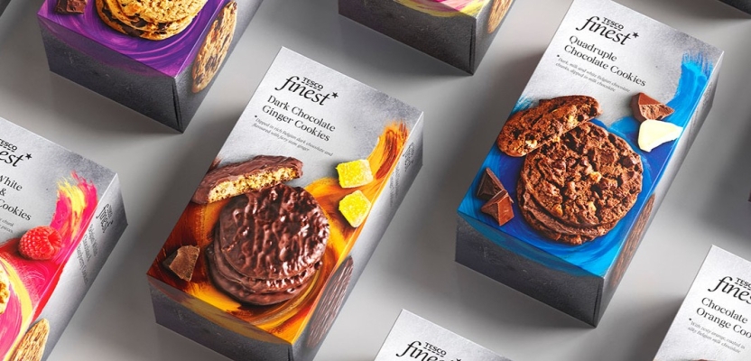
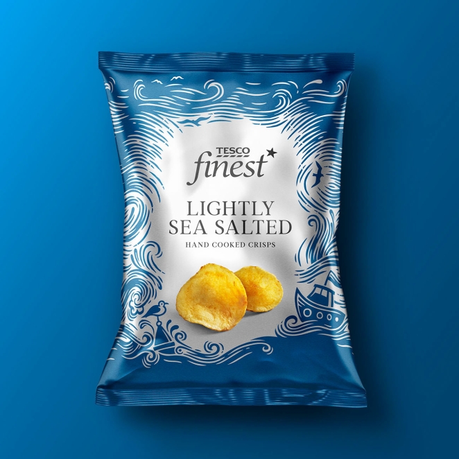
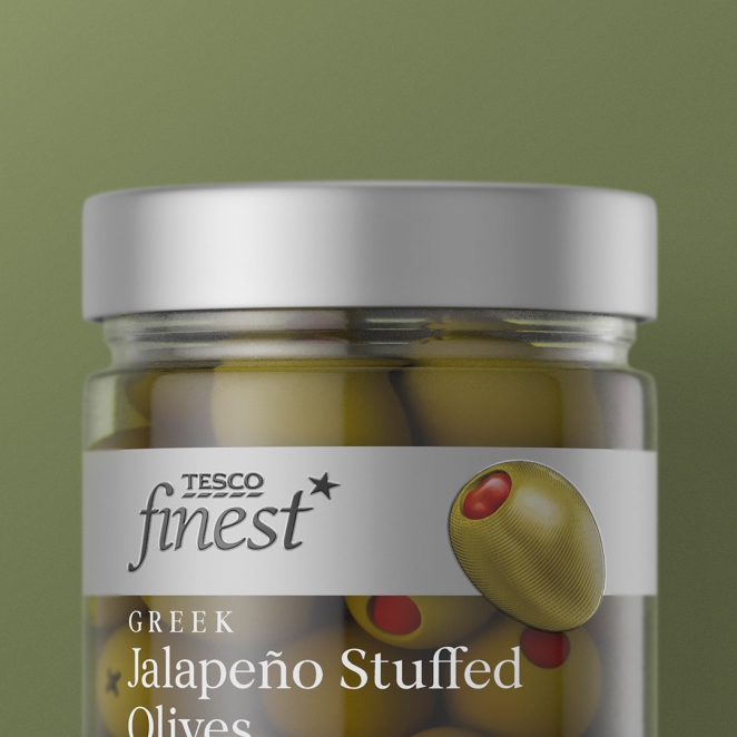
We did this by creating a tiered, volume up, volume down, visual hierarchy that maintains the right balance of Finest equity across all products. And yet enables product stories to be captured visually through photography and bespoke illustrations, suited to each category semiotic.
Did you learn anything new during the project?
For projects of this scale and complexity, a strong connection and working relationship between the agency and client needs to be in place for great work to surface. We became one team – regularly collaborating, strategising, and reviewing all creative and product designs together to ensure each packaging design solution captured and displayed what is great about each individual product.
The world of retail is fast paced, and products need to get to the shelf quickly, so fostering a happy and motivated design team was important. Working with the Tesco team, who truly understand and support the value that good design can bring, made the process satisfying and enjoyable. A happy design team produces its best work.
What was the biggest challenge? How did you overcome it?
We felt that there were two big challenges to address as part of the Finest refresh.
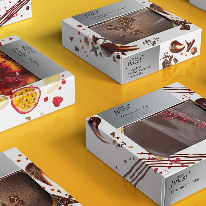
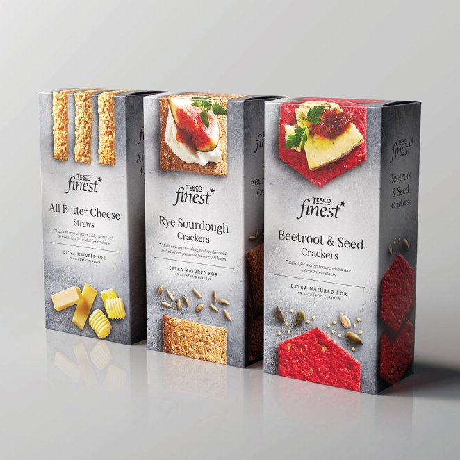
Firstly, we had noticed that the traditional ‘go-to’ codes of premium in this space were becoming predictable, dusty, and old fashioned. Other competitor ranges were all using the classic codes of black with touches of metallics and scripted fonts. We wanted to make sure our refresh stood apart from this with fresh new contemporary photography and bespoke vibrant illustrations to add pops of excitement.
We also realised that our competition was not just other supermarket premium ranges but new and innovative premium, sometimes smaller batch, private label product ranges that were quickly changing the visual language in categories that had long been fixed, static and expected in their visual approaches.
Of course, premium private labels can disrupt with unique, often expensive original design solutions. But our democratic proposition had to stretch across a whole brand ecosystem of over 1000 products.
Working in partnership with Tesco, we established the fundamental visual equities and strengths that the brand owned and began to implement a new pack architecture system. One that allowed for more evocative and flexible on-pack product storytelling that could be more bespoke and adaptable depending on the category.
What details are you most proud of any why?
We agreed early in the process that all new on-pack food photography needed to be of the highest standard with strong art direction and food styling. For this, we were lucky enough to collaborate with some of the best food photographers. Our challenge was to amplify the appeal, tempt the taste buds and make every little detail of the food simply irresistible.
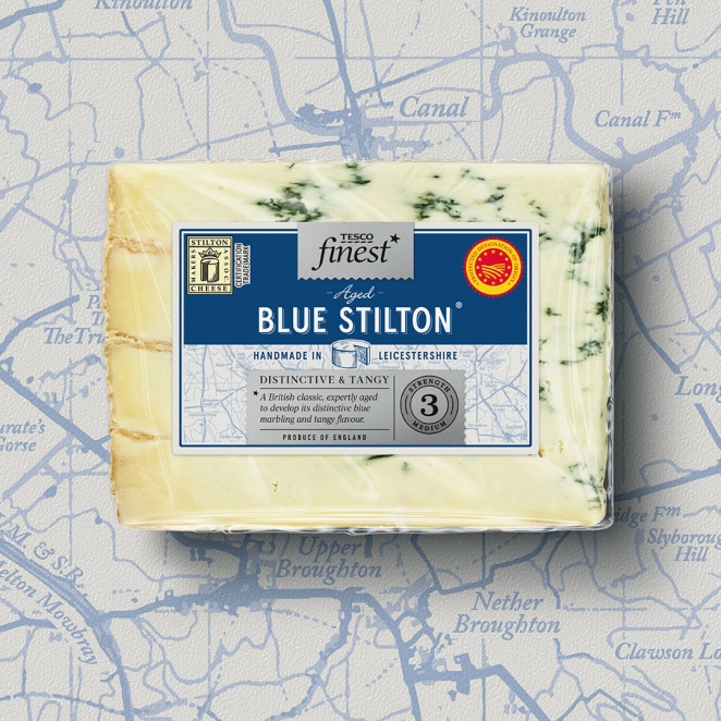
This new approach to food photography shows exactly how great-tasting food can be a celebration of the experiences that food gives us, the way it affects our mood, and how it adds to any occasion. The care, attention and dedication to every and every detail was a real labour of love and the new library of images are truly stunning.
What visual influences fuelled your solution?
There was not one specific influence, but we were constantly studying emerging food trends and product innovations. We keep abreast of changes in customer behavior towards diet and food consumption.
By updating our knowledge banks with a broader awareness of the categories we were working in, ensured we were able to give the Finest brand a contemporary and competitive perspective in an environment where codes of premium are constantly evolving and changing.
What do you hope it achieves for the brand?
We would like to think that the brand refresh provides the infrastructure, ambition, and direction for the Finest brand to be fit for future success and growth. It would be great to see new product ranges and product updates being easily and imaginatively introduced into the range and for a greater percentage of customers to truly understand how paying a little extra more can bring more enjoyment to everyday moments.
What would you do differently if you could do it over again?
Probably one of our joint agency/client ambitions would be to see how we can imbed more thought and functionality into the structural nature of the Finest packaging. It’s a delicate financial balance to create a pack design that can be made for a reasonable and responsible price.
Whilst also knowing that elevating and embedding structural components, tactile finishes and sustainability principles can be a very immediate brand in hand demonstration of keep-worthy quality and affordable luxury.
Credit list
Simon Threadkell - Tesco Group Marketing Director, Brand Design and Customer Experience
Caroline Kelly, Tesco Head of Design, Packaging
Sam Stone, Creative Director, Coley Porter Bell
Julie Petard, Head of Client Services, Coley Porter Bell
Matt Goodchild, Associate Creative Director, Coley Porter Bell
James Ramsden, ECD, Coley Porter Bell
Isaac Sodipo, Design Director, Coley Porter Bell
Michela Graci, Strategy Partner, Coley Porter Bell
Ruth Jenkins, Account Director, Coley Porter Bell